What it looks like

The dark theme is shown here; one button switches the whole application to light, sign-in screen included.

Every screenshot shows the same sample budget, signed in as the demonstration account "john doe". The bills, balances and card figures are invented examples chosen to exercise the app's warnings; none of it is a real person's finances.

The month you are in

Bills and income as two plain tables. Each bill carries its amount, category, what pays it and the day it falls, with Active, Skip and Paid as columns rather than buried in a dialog. Nothing here is a ledger of what already happened; it is the month as it currently stands.
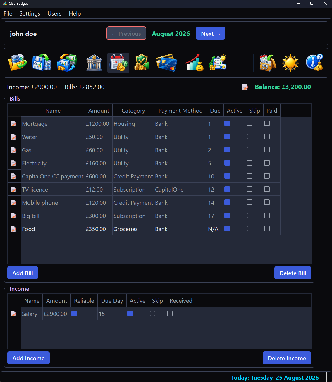
The Monthly Budget view of the john doe sample budget: a Bills table listing each bill with amount, category, payment method and due day beside Active, Skip and Paid checkboxes, an Income table below it and the current bank balance top right.
Monthly Budget. The balance top right maintains itself: dated items are applied on the day they fall due and tick themselves off, so nothing is counted twice. The sample month carries £1,400 of income against £2,400 of bills, which is what arms the warnings on the pages that follow.

Whether it holds

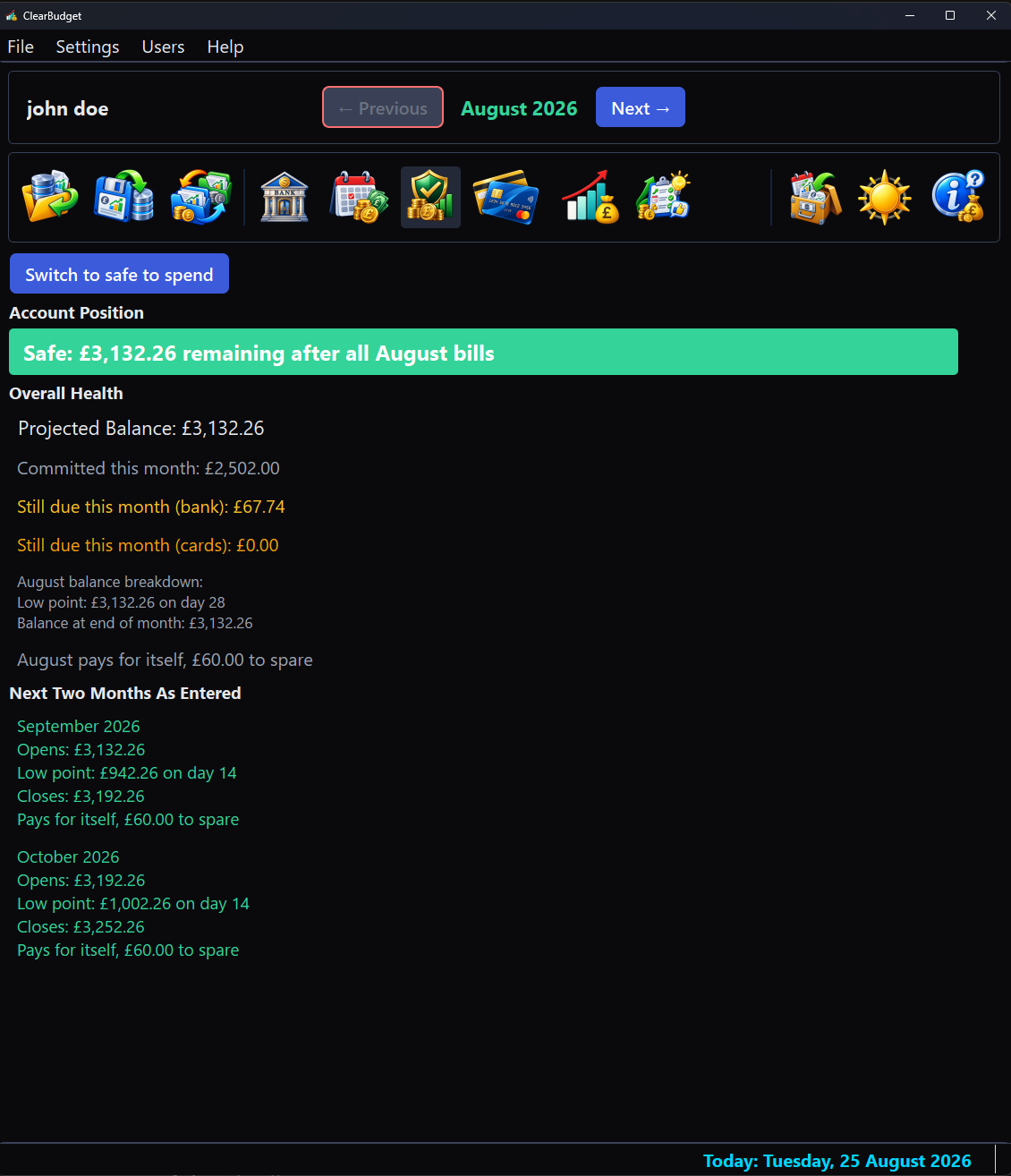
The bank page answers one question from money you have actually entered. It states the account position, then walks the next two months day by day, each naming its low point, the day that low falls on and what the month needs to hold flat. A month that cannot hold is not merely flagged; it is priced.

The Solvency view's bank page for the sample budget: an Account Position banner in green reading safe, an Overall Health breakdown of projected balance, committed and still-due amounts, then a Next Two Months As Entered block where the first month survives and the second is marked overdrawn in red with no overdraft facility.
Solvency, bank page. The sample account is safe this month and survives the next; the month after goes overdrawn with no facility arranged, which is a payment being refused rather than a warning about borrowing. Each month is priced: "needs £1,000.00 more to hold flat".

What you can actually spend

One number, with the promise behind it spelled out: how far it holds and the day that limits it. A month that cannot be rescued by spending nothing does not silence the figure, because that would be answering a different question; it gets its own line, in red, saying so plainly.
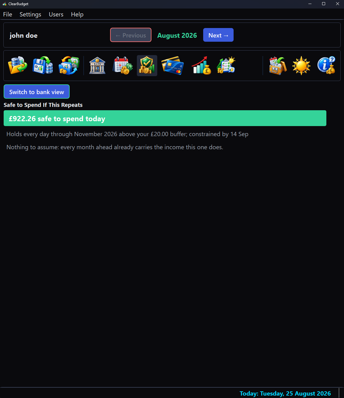
The Solvency view's Safe to Spend page for the sample budget: a large amber headline giving the amount safe to spend today, a muted line naming how far that holds above the buffer and the day constraining it, a red line naming a later month that is short whatever you do and a final line stating there is nothing to assume because every month ahead already carries this month's income.
Solvency, Safe to Spend page. Two colours because they are two kinds of statement: the muted line is a caution about a figure you can still act on, the red one reports a gap no restraint closes. The assumption the page rests on is stated in words; here there is nothing to assume, so it says exactly that.

Cards, priced forward

One panel per card carries its limit, what is used, the headroom left and the interest it is accruing. Beneath it, the projection runs each card forward and colours every month by the headroom it leaves rather than by the balance alone.
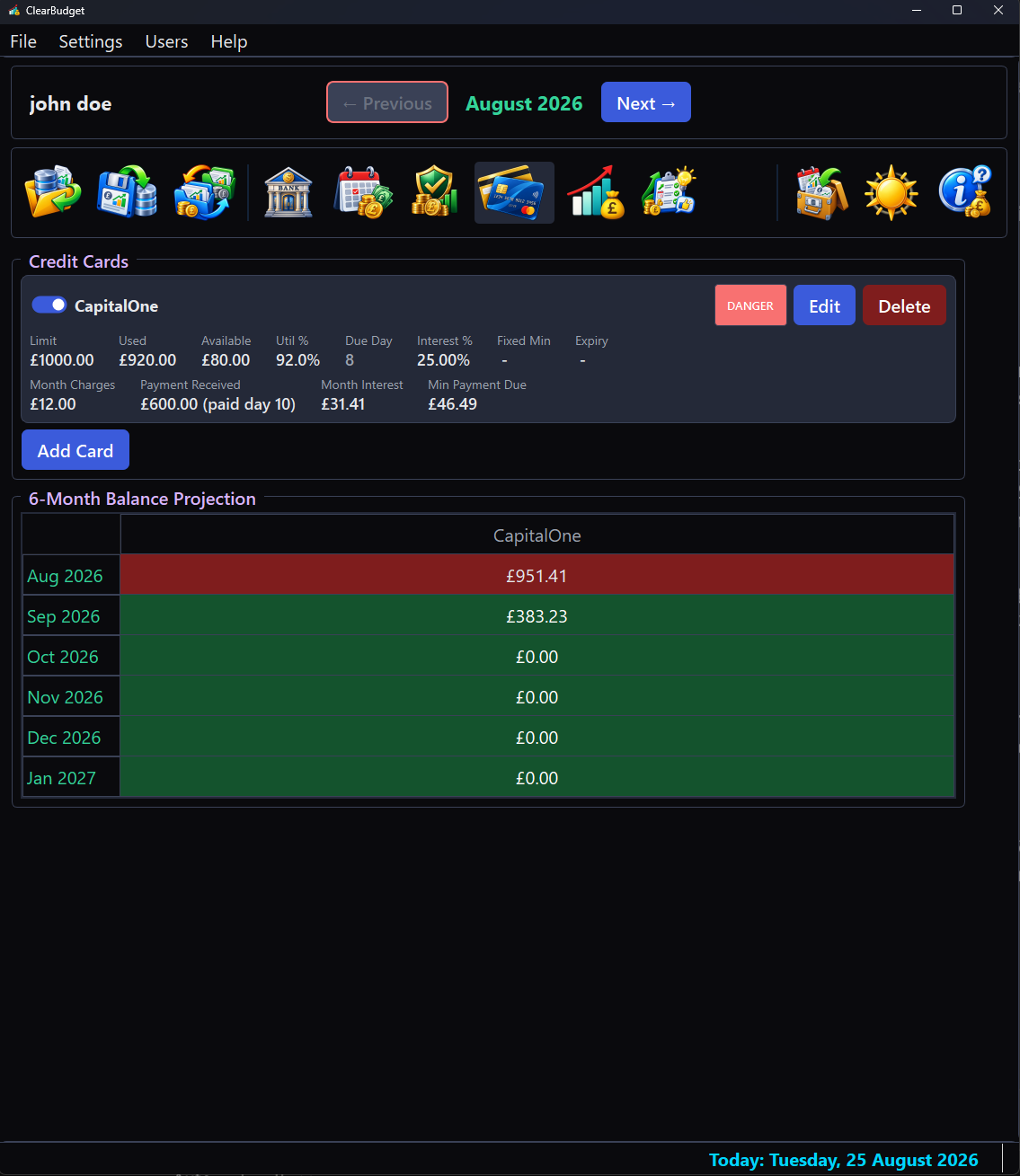
The Credit Cards view for the sample budget: a card panel showing limit, used, available, utilisation, due day, interest rate and this month's charges, payment and interest, with a red DANGER badge, above a six-month balance projection table whose rows shade from red through amber to green as the balance falls.
Credit Cards. The sample card sits at 92% utilisation, so its badge reads danger and the strip starts red; the projection greens as the monthly payment outruns the interest, so the recovery is visible months before it happens.

The month as a picture

Every day of the month as its own bar, with a curve following the real values rather than smoothing across them. The bars carry the verdict a single line cannot: the calm resting colour on a day the account is at or above zero, amber inside an overdraft you arranged and red only where a payment would actually bounce.
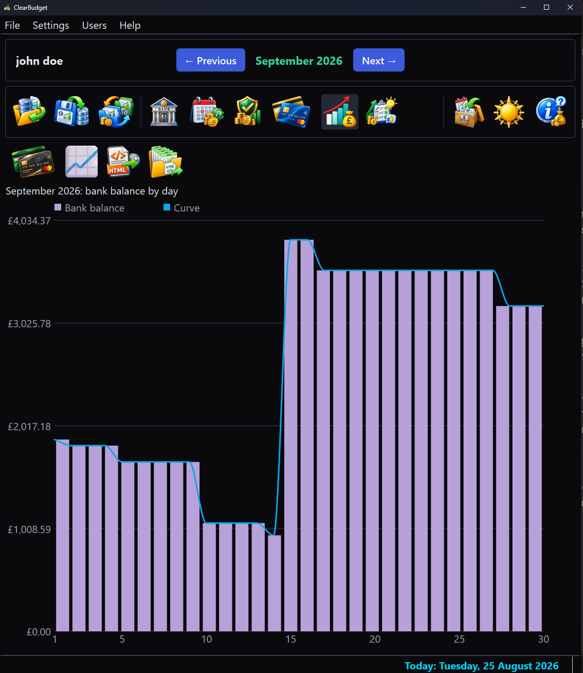
The Graph view plotting the sample budget's bank balance by day: lavender bars stepping down through the month with a light blue curve following them, the final days dropping below zero and drawn in red.
The Graph view reading the bank balance day by day, a page of its own stepped by the same Previous and Next as every other view. The sample month drains as bills fall due and the last few days go red: with no facility arranged, those are payments that would bounce.

Every card on one chart

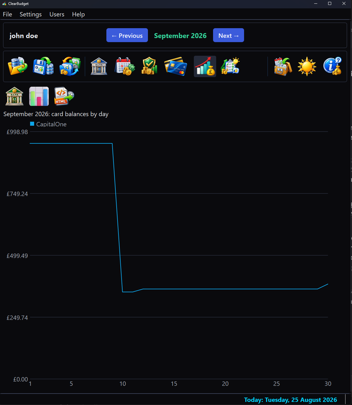
The same page, switched to the cards. One line per card, so a balance that is quietly climbing stands out against the ones being paid down; the switch's own face shows what a press will plot next.

The Graph view switched to card balances for the sample budget: a single light blue line for the one sample card, stepping down when its payment lands and rising slightly at month end as interest accrues.
The Graph view reading card balances by day. The sample card's line drops when its payment lands mid-month, then lifts at the month's end as interest is charged: the shape of a card being paid down faster than it grows.

What would fix it

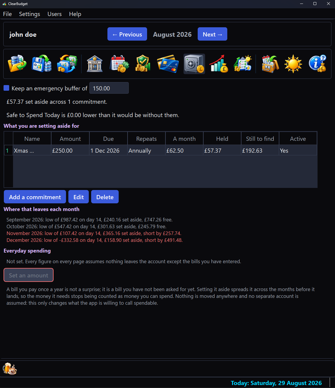
The Recommendations view says what would make the months ahead survivable, every figure a re-run of the same day-by-day projection the bank page uses. A difficult budget gets its bills retimed and its shortfall priced month by month; a healthy one, like the sample here, is told so plainly and offered the few retimings that buy slack it does not strictly need.
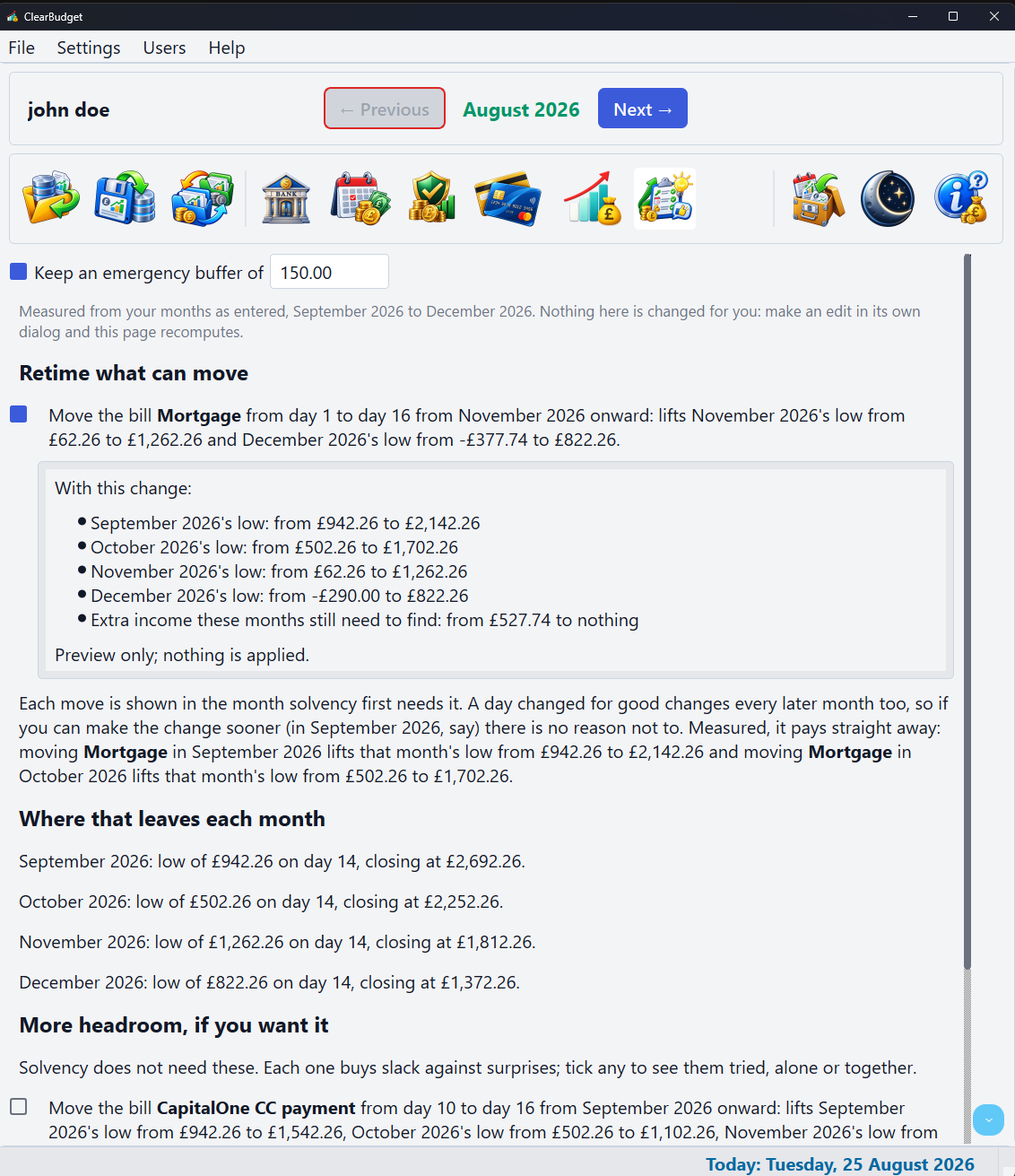
The Recommendations view for the sample budget: an emergency buffer row at the top, a Nothing Needed verdict, each month's low point and closing balance listed, then a More Headroom section of measured retiming suggestions with the first ticked and a preview panel of month-by-month lifts open beneath it.
Recommendations. Every suggestion carries its measured effect and a try-it-on tick: the open panel previews that change's lift month by month while applying nothing. You make the change in the real world first, then in its own dialog and the page recomputes; the app follows reality rather than leading it.